
With 30 distinct brands and 7,600 properties in 133 countries and territories, Marriott International has the most powerful portfolio in the hospitality industry. We worked to evolve the focus of their native app from a booking engine to an end-to-end, contextual travel digital ecosystem; elevating the value of their unified loyalty program and reaching far beyond platinum business travelers.

Goal
Create and lead a new global design team around the Marriott Bonvoy brand that was launch in order to stand out in an already crowded marketing space to excite our target: business and leisure travelers, 25 to 65 – a tech-savvy but time strapped target. Also we were told to figure out a way to leverage the ubiquitous smartphone itself as our secret marketing weapon
Approach
I started with a simple concept: the smartphone, like the smartphone traveler, is overworked and needs a vacation. The smartphone needed to “pitch” the traveler on the benefits of getting the new free Marriott mobile app…and getting them both a vacation. We worked across Marriott to ensure the theme was carried across all media – mobile, print, social, display, and hotel properties, and employed paid, owned, and earned assets as QR and SMS messaging was placed on ads, including boarding passes, hotel room keys, and Facebook ads (an industry first)
Results
I helped fulfill the Marriott Bonvoy promise—to make every journey rewarding—with a memorable, meaningful, and beautiful digital product. By strengthening cohesion across their many touch points, we helped usher in a brand system that can be leveraged across customer engagements from home to front desk to hotel room, and created a seamless and enjoyable experience for travelers across the globe.
Through our stakeholder interviews and the personal experience of the design and development teams on various products, we identified areas of improvement:
FASTER: Flexibility and speed to market.
Hotel brands need to constantly update their visual identities; currently, it is a long and very involved process.
RADICAL REUSABILITY: Increase the volume of completed projects and grow the number of products supported by the system.
Current tiles were supposed to be dynamic and reusable building blocks for delivering unified experiences on the platform, but because of their insufficient build, they were not reusable with up to 25 variations per tile.
FLEXIBILITY WITHIN GUARDRAILS: Healthy balance of consistency and contextualization. Reduce resources per project.
Our current design templates offered plenty of consistency but were not flexible enough for context changes or hyper localization.
SAFETY AND SECURITY: Ensure that the code is protected.
The high volume of transactions going through the site requires that the code is protected from anything and everything.
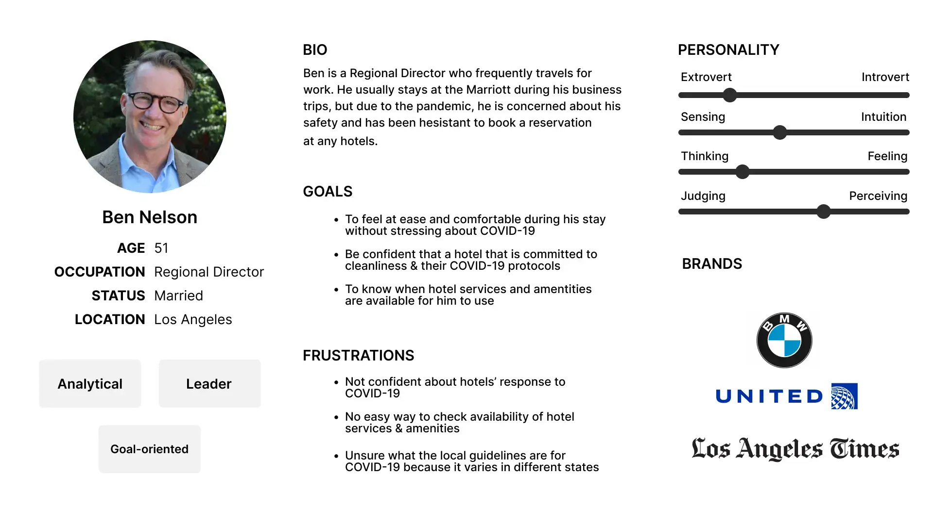
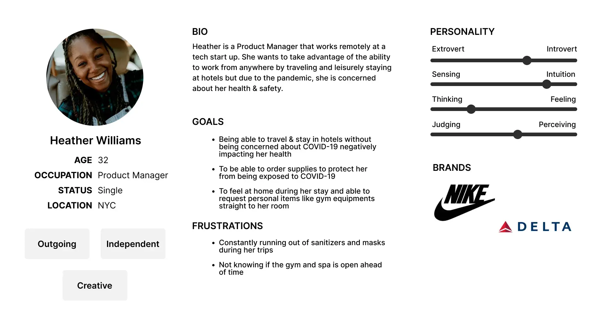
We revitalized the personas by workshopping with Marketing and Loyalty (Bonvoy) to establish greater strengths around our strategy.
Theses personas were printed and place in parts of Marriott HQ in Bethesda.
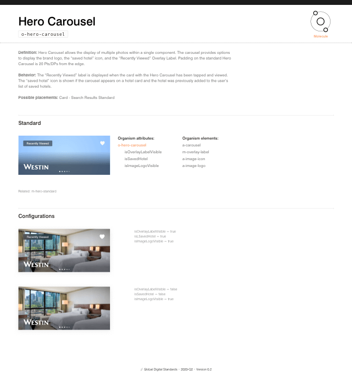
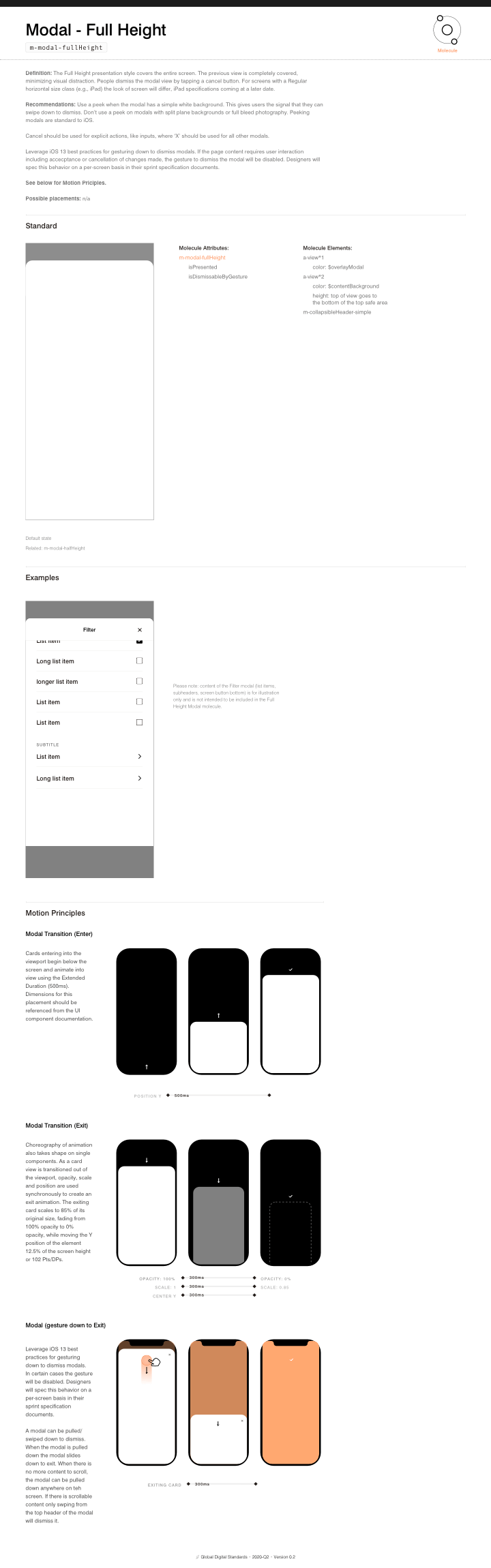
In order to keep consistency and create radical reusability, we needed to build a pattern library in Sketch. We identified how individual elements such as buttons, text headers, and navigation could be combined to make up larger components. These components could build sections of a page, which when combined create an entire layout.
We met with the development team often to get their input on implementation; this unity between the two teams led to increased productivity and improvement in product quality. To work around the problem of not allowing multiple designers to work on the same Sketch file at the same time, designers had their own local files, on which they would work on specific components or features. Once those components were completed and signed off on, only then could the pattern library lead push their work to the master pattern library document.

We started out by dedicating time as a team to examine the patterns and components that already existed. Collectively we made hard choices around what to keep and what to let go. We also discussed our philosophies around how we used various elements of the components from an atomic design perspective.
For the design team, designers were working on their Sketch files in their own silos, using and creating their own symbols. When it came time to hand off their designs to developers, design spec documents were inconsistent.
On the development side, individual teams were creating their own components without consulting other teams about recommendations or best practices. Additionally, when presented with handoff documents from designers, the design vision sometimes did not play out as intended when coded.
React UI Component Library
& Storybook
Components to serve the product
This library is a collection of presentational UI components (such as buttons, cards, form fields, icons, etc.) built in React to power the front-end experience of products. They strictly deal with UI structure, style, and interaction, and are built to be consistently reused across products. React is used for UI markup as JSX and Storybook is used for the component viewer.


Design Tokens
The key to scalability
Design tokens are design variables stored in a technology-agnostic location. They are translated into technology-specific formats like Sass variables for web projects and an iOS-specific format for native iOS projects. This allows the organization of common brand attributes in a central location, enabling one-stop updates to brand colors or typefaces. The React UI Component Library consumes the design tokens as a project dependency and feeds the token values into the UI components. Our senior UX designer would meet frequently with the development team to make updates to the tokens and edit the properties file in the token repository.
Reference Site
Central hub for documentation
The reference website serves as the central hub for documentation and all things related to the design system. It contains a homepage, a getting-started guide, high-level guidelines, detailed component documentation, API documentation, links to tools and resources, contribution/support instructions, and more.
After reviewing other reference site tools, we landed on Zeroheight because it aligns with the most features Marriott needed. The documentation to be included are imported live components and code snippets, UX guidelines, content authoring docs and component API documentation.
Design System Page 1
Design System Pages 6
Design System Pages 5
Design System Pages 4
Design System Pages 3
Design System Pages 2
Prototyping Refined Our Strategy
Throughout our design process, we created motion studies, lightweight interactions in Principle, and native code to prove our UX decisions.
We validated our app experiences in Swift to find performant expressions for our designs and fine-tune micro-interactions within the app. Our prototypes helped us iterate on tailored experiences while working within the constraints of the platform. We distributed our work to stakeholder devices, enabling them to test our interactions and experience our progress firsthand.
Example: Learnings from Testing
After auditing the onboarding experience during our usability testing, we identified the least intrusive ways to service sign-up, while also educating users on the features and benefits of the program.
As part of this exercise, we established a unique illustration style for these empty states.

Across Touchpoints, Around the World
We helped fulfill the Marriott Bonvoy promise—to make every journey rewarding—with a memorable, meaningful, and beautiful digital product. By strengthening cohesion across their many touch points, we helped usher in a brand system that can be leveraged across customer engagements from home to front desk to hotel room, and created a seamless and enjoyable experience for travelers across the globe.

Ryan Dodd
Intuitive, user-centered experiences aiming for delight and empowerment