Walmart | Website Redesign
Goal
Within the framework of the Cart and Checkout team, my duties encompassed the application and contribution towards a novel design language. This initiative was strategically focused on empowering our clientele to achieve greater savings and enhance their living standards.
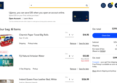
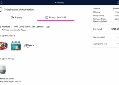
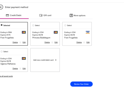
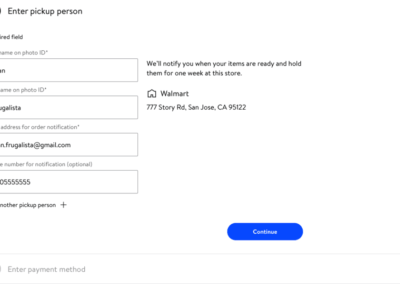
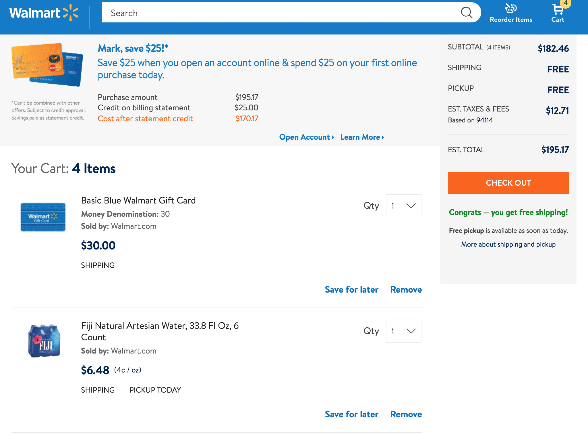
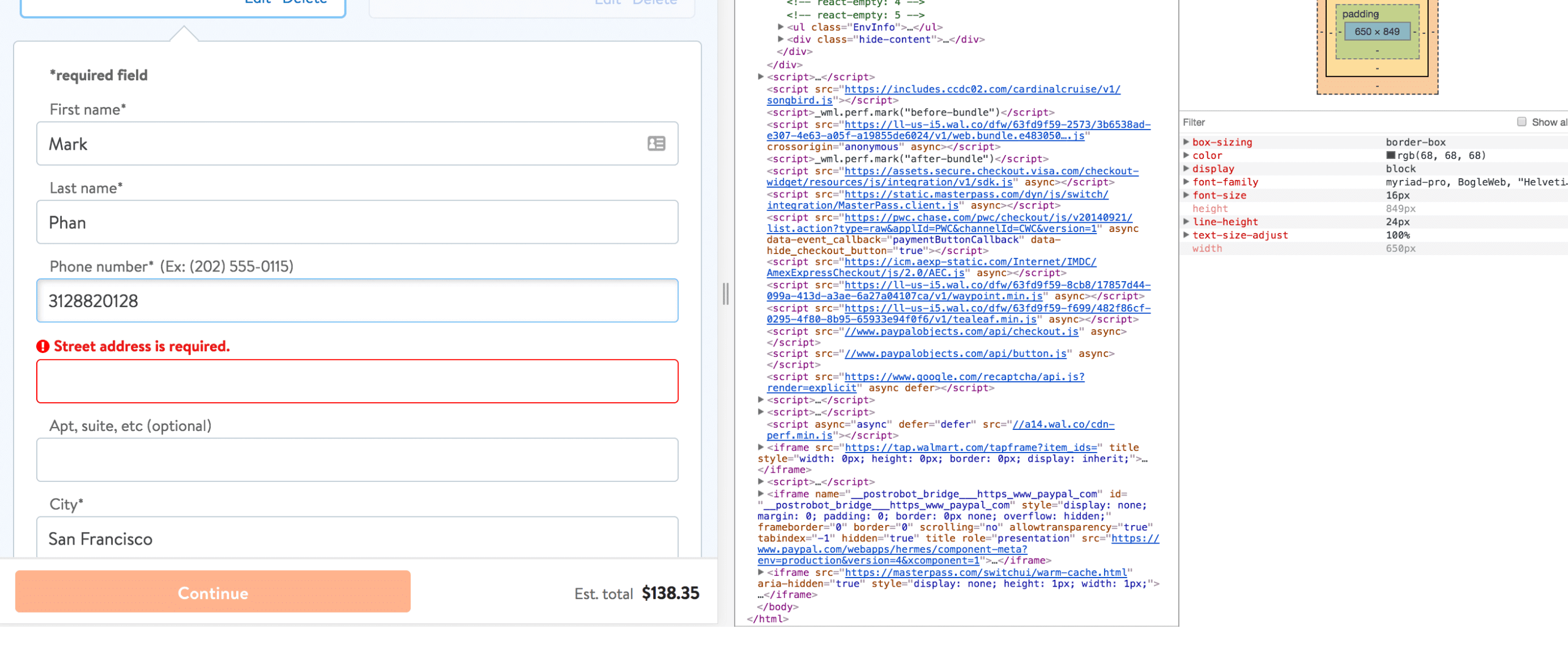
The checkout pages in question were developed by a predecessor team, which has since been disbanded. Upon inheriting the project, we encountered a significant challenge due to the fact that the provided design files were outdated and did not reflect the website’s current state. A dedicated team consisting of three designers was assigned the responsibility of meticulously documenting the existing checkout process as it stands in production. Following this, the team embarked on recreating these files within Sketch, thereby establishing a contemporary baseline for future development efforts.
Process
Documenting the current state
The checkout pages in question were developed by a predecessor team, which has since been disbanded. Upon inheriting the project, we encountered a significant challenge due to the fact that the provided design files were outdated and did not reflect the website’s current state. A dedicated team consisting of three designers was assigned the responsibility of meticulously documenting the existing checkout process as it stands in production. Following this, the team embarked on recreating these files within Sketch, thereby establishing a contemporary baseline for future development efforts.
Exploring the User Scenarios
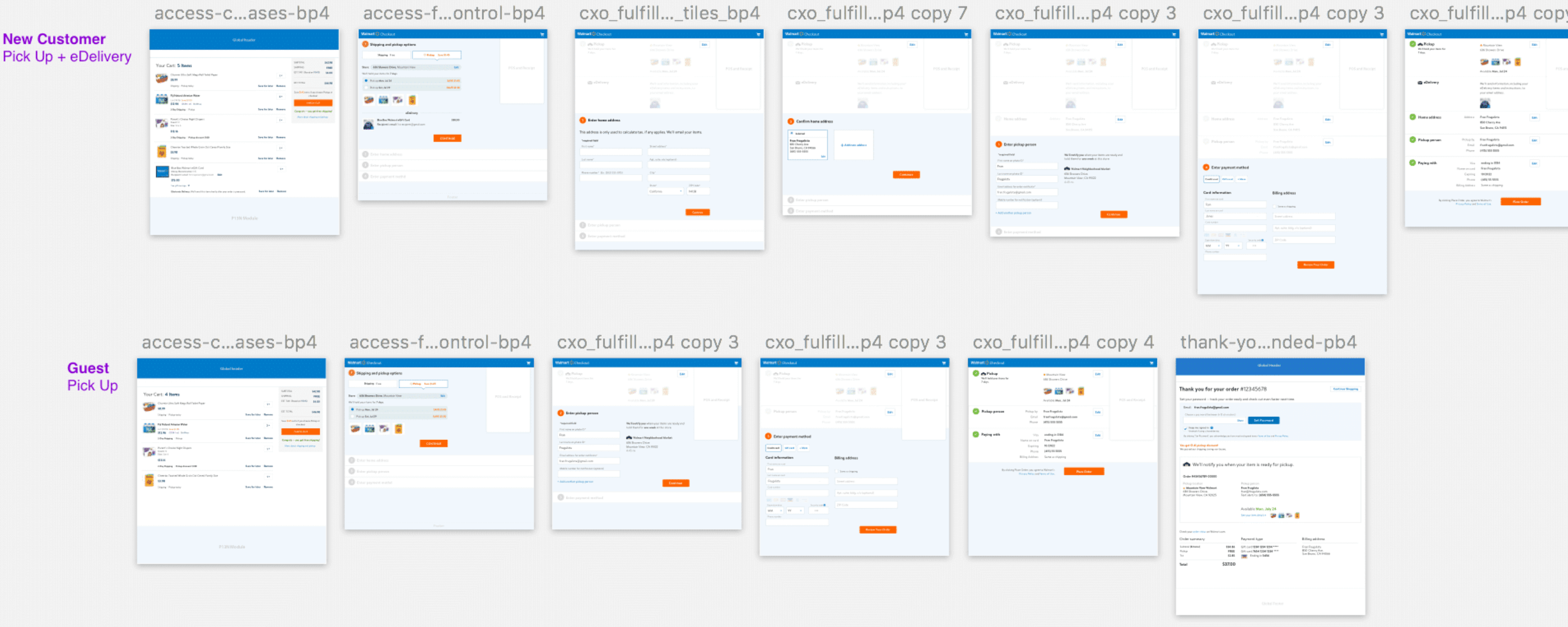
Upon completing the documentation of the optimal process, I proceeded to outline specific application scenarios, including those for existing users, new users, and guests. These scenarios encompassed a variety of components, each contingent upon the completion of specific tasks such as shipping, pickup, or electronic delivery. To guarantee comprehensive coverage, I developed an end-to-end workflow that meticulously accounted for all potential use cases.
Enhancing Platform Accessibility Compliance
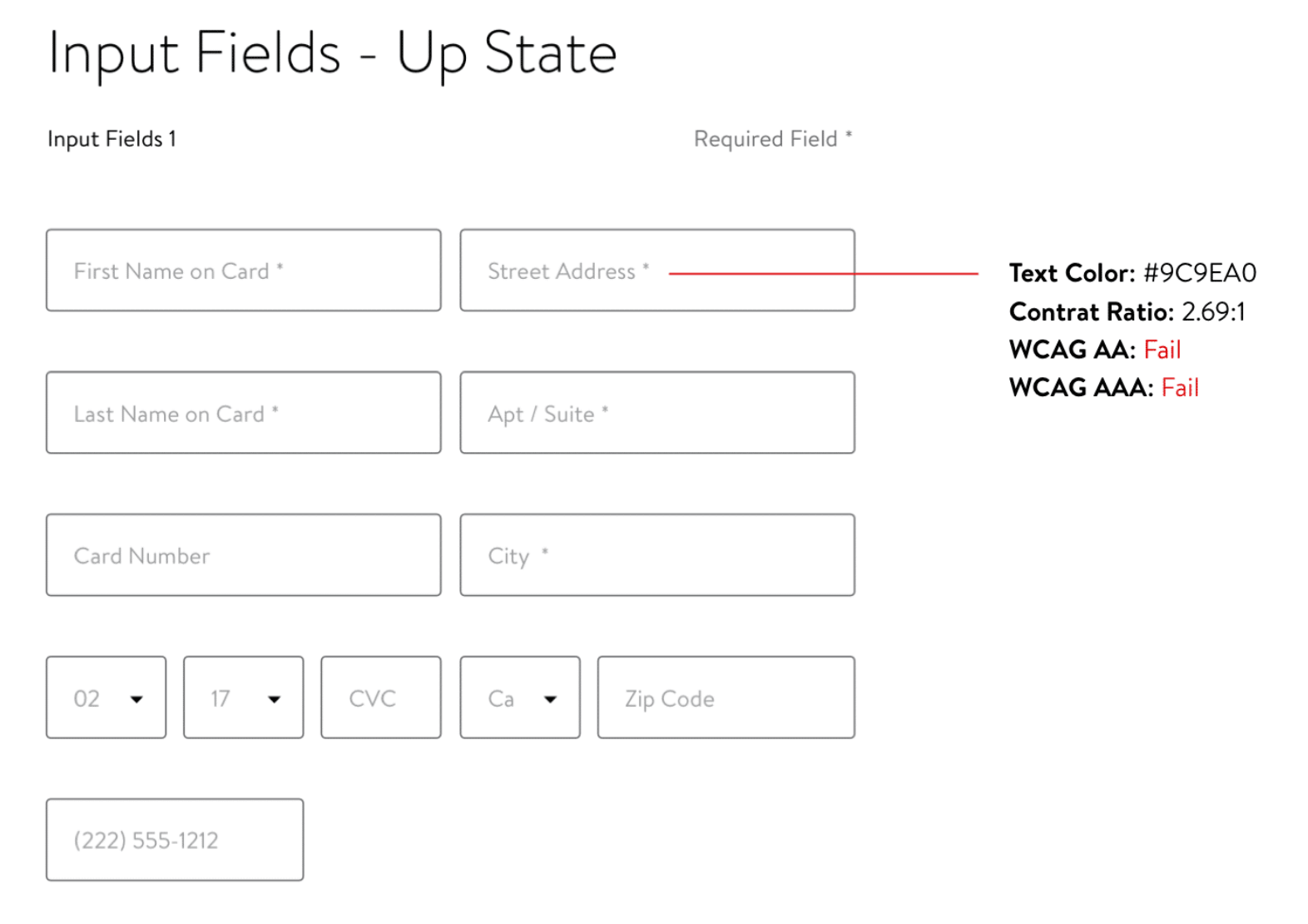
During the development phase of our programming language by the platform team, it came to my attention that certain elements were not aligned with the Americans with Disabilities Act (ADA) standards. Specifically, issues were identified with the user interface components, including input field labels being embedded within the fields themselves and a lack of sufficient color contrast to meet the Web Content Accessibility Guidelines (WCAG) 2.0 Level AA.
Furthermore, the approach to form labels posed additional accessibility challenges. It was observed that form labels were designed to vanish upon user interaction with the form fields. This design choice could potentially hinder users from verifying their inputs, as the disappearing labels prevent a reconfirmation of the entered data.
Upon recognizing these accessibility barriers, I promptly communicated these concerns to the development team. In response, the team undertook revisions to enhance the component’s accessibility. These modifications ensure compliance with ADA standards, thereby extending accessibility to a broader range of users across various platforms sharing this component.
Introducing New Components
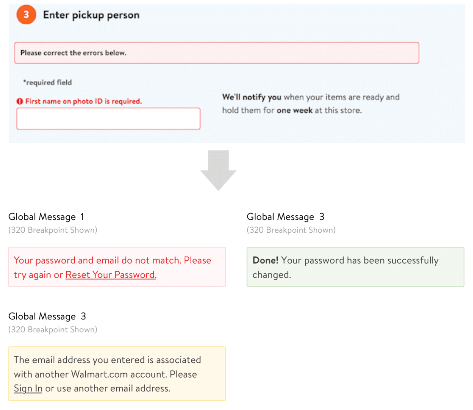
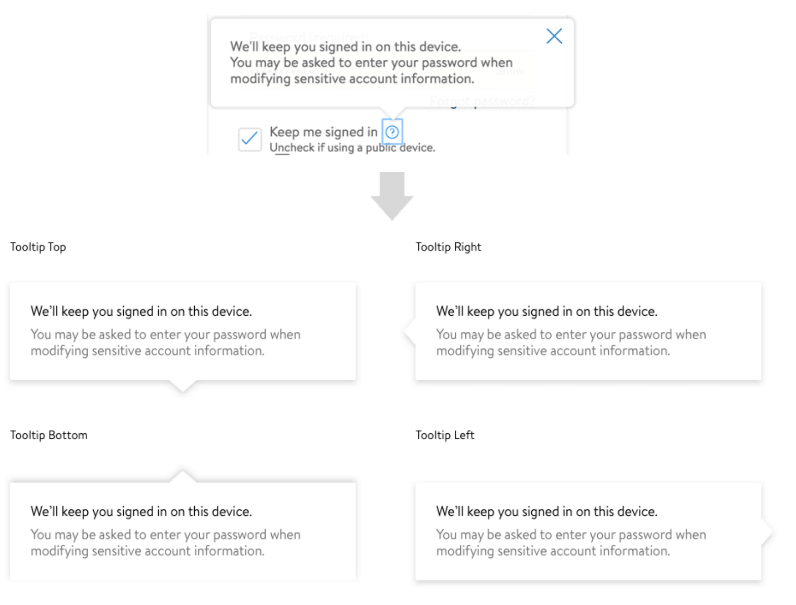
In the process of documenting the current checkout flow, it was identified that several crucial elements were absent from the pattern library. Specifically, global error messaging and fly outs emerged as patterns that were consistently utilized throughout the site.
Identifying the Insufficient Engineering Capacity to Meet the Project Deadline
The engineering team concentrated their efforts on the homepage and core aspects of the website, subsequently recognizing a shortfall in capacity to execute the redesign across multiple verticals. The proposed design introduces an entirely new grid system, distinct from that of our existing site, necessitating a significant increase in engineering resources for reimplementation.
In response, I was tasked with developing a simplified version of several screens, adhering to the original grid layout. This approach was intended to mitigate the workload and assist in achieving our scheduled launch date with efficiency.
Providing precise design specifications for development execution
I collaborated extensively with my colleagues in engineering and product development to address any inquiries or issues they raised concerning the new design proposals. Throughout the process, particularly during the review meeting, it was brought to my attention that there were several use cases I had overlooked. Due to limited access to certain sections of the site, I coordinated with the development team to secure access to a testing environment, enabling a comprehensive examination of the specific use cases in question.
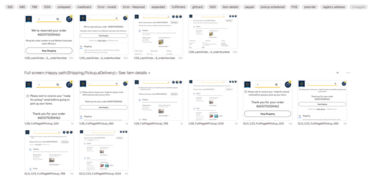
We utilized Figma’s new Devmode to facilitate easy access for developers to both new and existing screens. Given the rapid pace and the frequent updates characteristic of this project, it was crucial to ensure that developers stayed abreast of any modifications. By annotating my most recent designs and tagging the relevant engineering colleague, I aimed to guarantee that they were fully informed of the changes implemented.
Results
User testing showed customers reacted positively to the new design:
“I hardly recognized it as Walmart; it appeared beautiful, enticing me to explore the showcased features.”
“This new navigation system is undoubtedly superior.”
“The current design resembles Wayfair a bit more… it exudes a tranquil, calming, and aesthetically pleasing vibe. Unlike its current state, which feels cluttered like an infomercial or Toys R Us – somewhat chaotic.”
“The redesign brings a fresh, modern, easy, and quick feel.”
“It’s beautiful and simple; it doesn’t scream Walmart. With a streamlined navigation, it feels clearer, warmer, and less overwhelming.”
Key Learnings
Documenting the current status and applications required a significant investment of time, yet it substantially enhanced my comprehension of the customer journey. It is common to concentrate on the optimal user experience; however, my analysis revealed numerous exceptional scenarios that could hinder the checkout process for customers. Regular consultations with engineering and product teams were crucial in ensuring that all essential use cases for the checkout procedure were thoroughly addressed.
Ryan Dodd
Intuitive, user-centered experiences aiming for delight and empowerment

